Client:Harrah's Electric
Date:Late 2014
Website:Coming Soon
Harrah's Electric was founded in late 2014 by Josh Harrah. I was approached by him to create a logo and brand identity which would stand out from other companies in the Lincoln and Omaha, Nebraska areas.
Inspiration
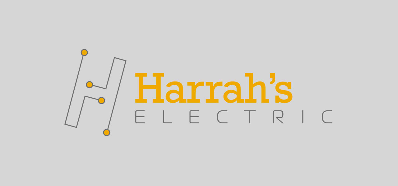
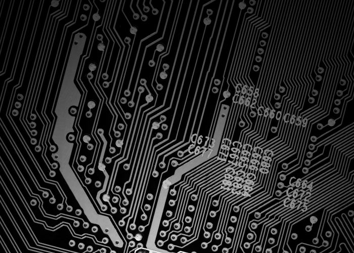
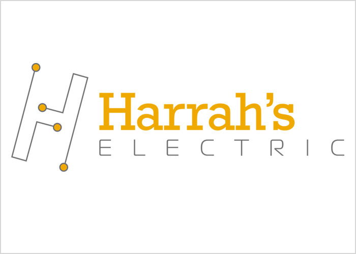
The tilted 'H' in the Harrah's logo was inspired by circut boards. Also, the tilted 'H' is universal from multiple directions. The 'H' is composed of 2 elements which are mirror reflections of the same design.
Logo Design
I conducted area market research and discovered that most other area electrical companies used Blue in their logos. Thus, to help Harrah's Electric stand out; I used a yellow complemented by grey in the logo design. Additionally, I like using contrasting serif and san serif font types in the logo design.
Continued Branding
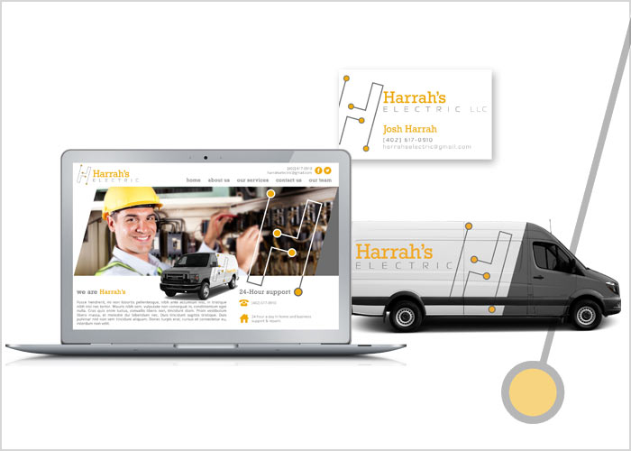
Since Harrah's Electric is an on going client of mine; future branding, identity development and design include vehicle and website design. My hope is that these design elements will be implimented in late 2015 or early 2016.